
In the project, one of the tasks that we have been assigned related to visualization. No need to say how important this is: with poor visualization every information will be lost or subject to misinterpretation – with a good one, the message finds the recipient timely and in the most effective manner.
In CS-AWARE we needed neither to invent the wheel nor to re-invent the wheel – we only needed to come up with a visual cue that might attract attention and also have the potential to become viral in terms of attracting people’s interest to use it for other purposes as well.
We are all aware about graphic representations with use of histograms and bars: they are good in case used for a powerpoint presentation, but not necessarily suitable for use in a critical infrastructures context, to alert users or provide with actionable information.
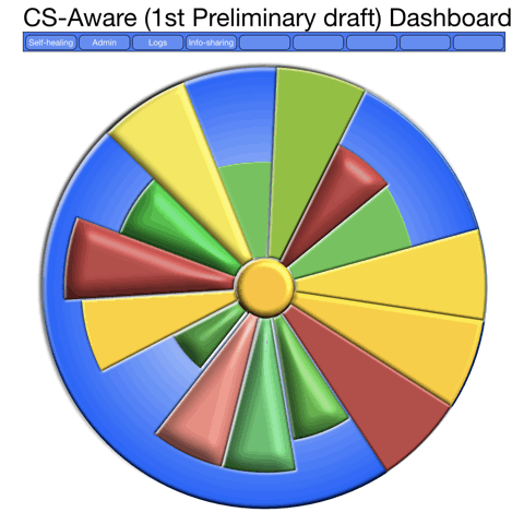
Pie charts are in general underrepresented – for some reasons they are regarded as difficult to handle and not as efficient to convey a message. So we saw there a great potential for building a widget that might be extensible into other fields. We call it the ‘wheel of fortune’ – though it actually has nothing to do with the latter. Below we present mock-ups which are not final products of course but provide a good idea of the structure and the conceptual and visual aspects of such a ‘dashboard’.
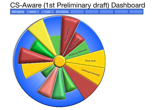
The basic idea is that instead of using the entire 360 degrees of a full circle, we use only as many as necessary to represent the different threats – for this, we have tried to optimize the visual aspects so that with fewer threats the result will not have a weak appeal, while with more threats to avoid confusion and mental overload. It keeps the message simple.
What is needed, though is to use the brains capacity not just to infer levels of danger using colours, but also to grasp the difference over time, as in this GIF, where it is obvious that we should have a closer look into the changing part, as it repeats the past 10-30 minutes or so of cyber security events, in this case where we see how the the SQL-injection attempts are becoming more alarming. We are just at an early stage of the design, as a design process rarely begins with the final result, but we are now able to move on to programming and making it look better, as the end users should feel comfortable having it on a screen all or most of the time.
Kim Gammelgaard & Christian Weithøft,
CloudPartners
